Your Mentionlytics dashboards already tell you a lot. But sometimes, you need to see your social listening data in a very specific way that the standard charts don’t quite cover.
We totally get it, and that’s why we’ve got you a little treat. Say hi to Dynamic Component: the new custom chart builder that lets you visualize your Mentionlytics data exactly the way you want it.
What Is the New Dynamic Component?
Dynamic Component is a new addition to your custom dashboards and reports in Mentionlytics, giving you a blank canvas to build charts from scratch, choosing the data, the chart type, the layout, the colors, the filters, and more.
It’s kind of a Looker Studio, but only for your social listening insights.
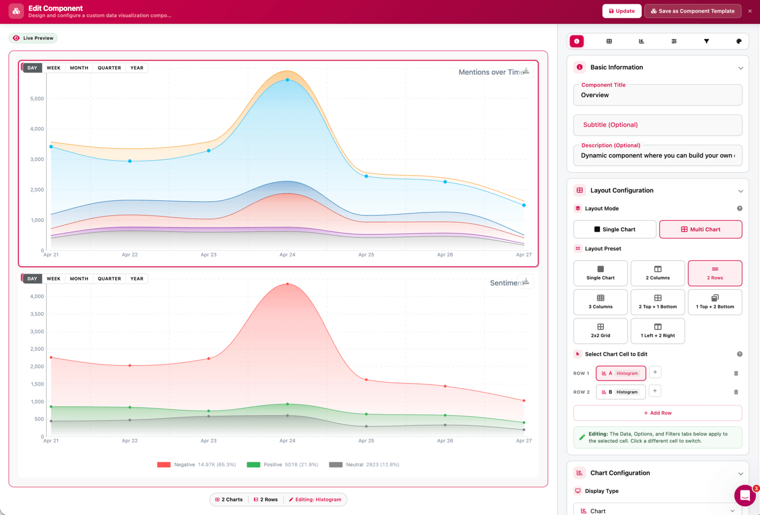
Instead of working around pre-built charts, now you decide what goes in, how it looks, and how it’s organized. Whether you want a single focused chart or a full multi-chart layout combining different metrics side by side, Dynamic Component gives you a data visualization studio to make it happen.
Dynamic Component’s Core Capabilities Explained
Dynamic Component has a lot of functions and capabilities. Here, we broke down what you can experiment with.
Layout Options
Go single chart or multi-chart. If you pick multi-chart, you can arrange them in 2 columns, 2 rows, 3 columns, a 2×2 grid, or several other split configurations. Each cell in your layout can hold a completely different chart with different data.
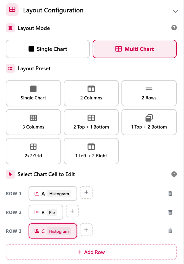
Chart Types
Choose the chart type you prefer from:
- Histogram
- Bar Chart
- Pie Chart
- Doughnut Chart
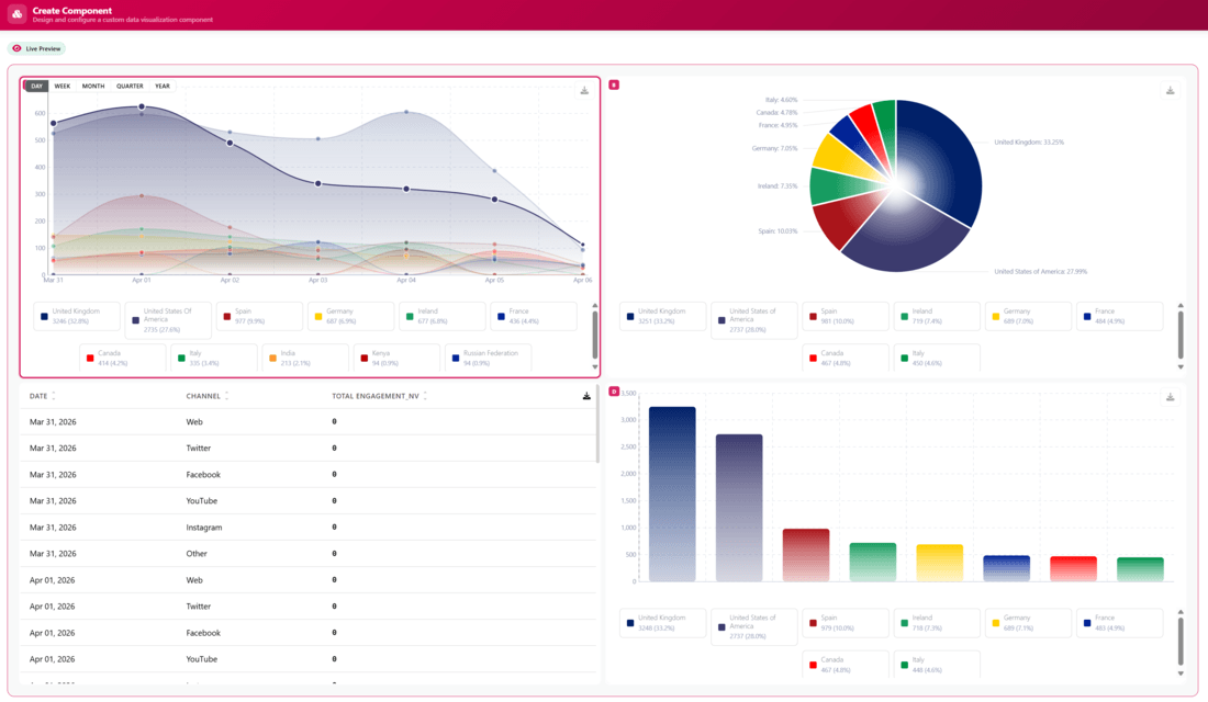
The type depends on which format best tells your story. Radar and polar chart options will be released soon.
Data & Metrics
Set your “Group By” fields (Axis 1) and “Metric fields” (Axis 2). You can group your data by:
- Time
- Country
- Keyword/Profile
- Channels
- Category
- Language
- Tracker
- Profile Username
- Labels
- Tags
- Assigned User
- Sentiment
- Subtype (a.k.a. Content Type)
- Subreddit
- Emotion
- Entity Label & Text (for image mentions)
You can choose between these Metric Fields:
- Mentions
- Reach
- Engagement
- Engagement (inc. views)
- Impressions
- Likes
- Comments
- Replies
- Shares
- Facebook Shares
- Pin Shares
- Quotes
- Taps Forward
- Taps Back
- Views
- Unique Views
- Visits
- Rank
- Relevance
- EMV
Also, you may choose the data aggregation method you want from Sum, Average, Maximum, or Minimum.
For example, you can group by Time and measure Mentions with a Sum aggregation or mix it up with other combinations.
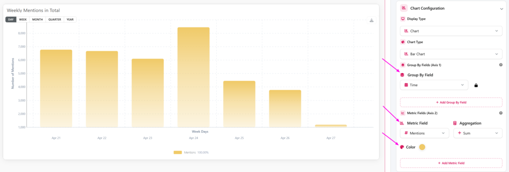
You can even add multiple metric fields and assign each one a distinct color (only in histogram and bar charts).
Component Filters
Narrow down the data available to your chart builder by:
- Tracker
- Channel & Category
- Content Type
- Sentiment
- Emotion
- Tags
- Tracker Type
- Presets
For example, if you want to create a histogram showing the reach of your competitors’ mentions over the past week, you’ll need to go to Component Filters and select only your competitors in Trackers.
Appearance
Adjust the Bezier Curve for smooth or sharp lines, pick a Fill Mode (solid or gradient), set your Border Thickness, and control Data Point size (including how they look on hover). Each graph has slightly different appearance options you can explore.
Legend & Titles
Add a chart title, set axis labels, position your legend (top, bottom, left, right), enable compact mode, and choose whether to show colors in the legend. It’s all there.
Examples of How to Use the Dynamic Component
Let’s give you some ideas on how to start integrating dynamic components into your custom dashboards and reports.
Compare Your Mentions Volume to Your Biggest Competitor
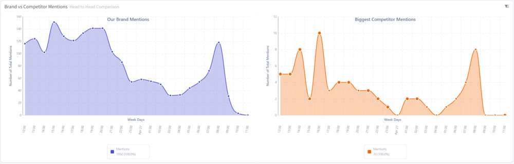
Set up a multi-chart layout with 2 columns. In the left cell, pull in mentions of your brand. In the right cell, pull in mentions of your biggest competitor, using the Tracker filter to separate them.
Use a histogram with the same time axis on both so you can compare volume trends week over week. Add solid fill and matching time granularity for a clean, easy-to-read comparison that your client or team can understand at a glance.
Monitor Sentiment Breakdown by Channel
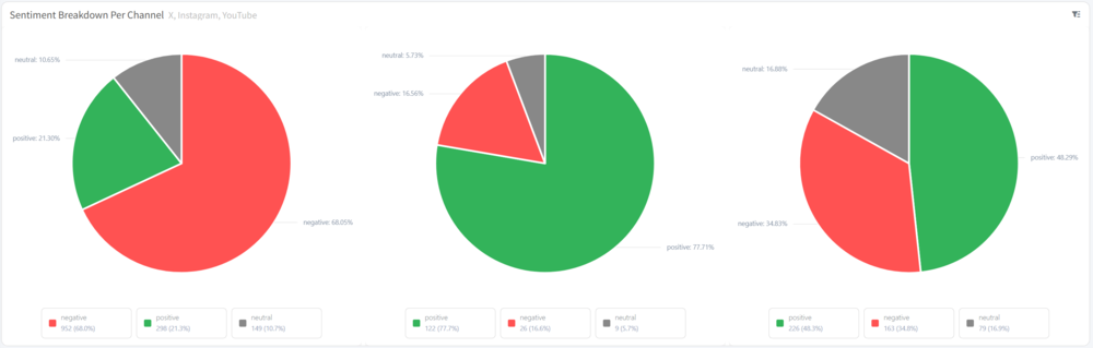
Create a multi-chart layout with a pie chart for each major channel. Let’s say, one for X (formerly Twitter), one for Instagram, and one for YouTube.
Filter each chart by Channel, and set the metric to measure Mention Sentiment Share.
This gives you an instant visual snapshot of where your audience is most positive, most critical, or most mixed, which is especially useful when you want to improve your reputation, as it gives you a starting point.
Build a Campaign Performance Dashboard
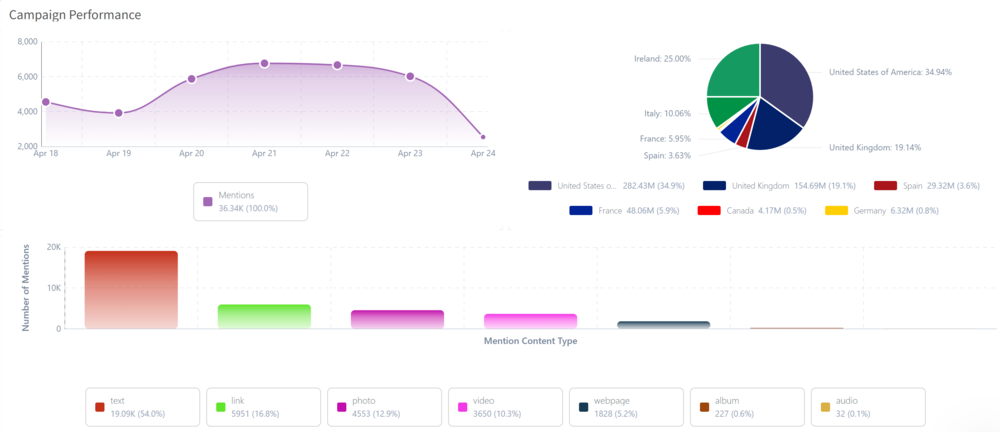
Let’s say you run a campaign with a specific topic, e.g., “Adidas Superstar”.
Set up a 2 top + 1 bottom layout. The top-left chart shows Mention Volume Over Time (histogram). The top-right shows Reach by Country to identify where your campaign is getting a wider audience. The bottom chart spans the full width and breaks down Mentions by Content Type using a bar chart, so you can see whether your campaign is picking up more on news, social, or video platforms.
Filter all three by the same tracker or tag to keep everything campaign-specific.
Where to Find the New Dynamic Component
Dynamic Component is available inside your custom dashboards and reports. When adding a new component, scroll down and locate the Dynamic Component option and start building from there.
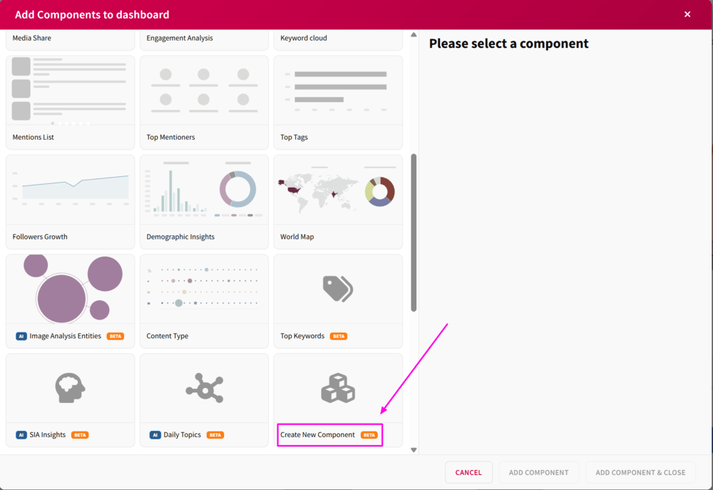
You can also save a dynamic component as a template to reuse it on other dashboards or pick a ready-to-use dynamic component from our presets.
Try the New Dynamic Component Now
Dynamic Component is available on Pro and higher-tier plans. If you’re on a lower-tier plan or doing a free trial, contact our support team to walk you through this new feature.
Ready to build something? Log in to your account now and begin your construction works.