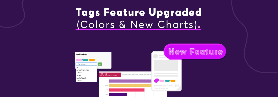
Remember those grey, utilitarian tags you used to categorize your mentions in Mentionlytics? Surely useful to keep tabs on specific topics (e.g., product discussions). But let’s be honest, a little… boring.
Well, get ready to leave behind the monochrome and embrace a burst of color and new insightful charts!
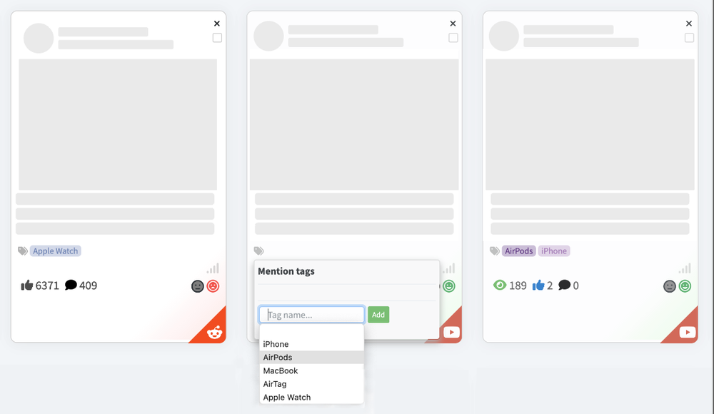
We’ve given our Tags feature a complete makeover, bringing color to your comparisons in the Top Tags and new charts to help you analyze your tagged mentions easily!
New Colorful Tags
Wondering how it works?
So, let’s say you’re managing social listening for a brand like Apple. You use tags to track mentions related to your various products — iPhone, MacBook, AirPods, AirTag, and Apple Watch.
Previously, these tags were all visually indistinguishable in grey.
Now, you can assign a unique, vibrant color to each product tag making your Top Tags component in reports and the Overview Dashboard look like this ⬇️
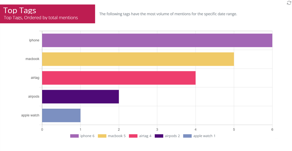
No more squinting at text labels. Α quick glance tells you everything you need to know.
Why is this a game-changer?
- Enhanced Reporting: Make your reports more engaging and easier to understand.
- Improved Dashboard Overview: Get a clear, at-a-glance understanding of your data.
Beyond Color: Introducing New Charts
The visual upgrade doesn’t stop at color. We’ve also introduced new chart types to help you analyze your tagged mentions in more detail.
Doughnut Chart
Want to see the proportional distribution of your mentions across different tags? Switch your Top Tags box from a bar chart to a sleek doughnut chart.

This is perfect for quickly understanding which tagged categories are dominating your mentions.
Line Chart
Do you need to track the evolution of your tagged mentions over time? The new line chart lets you visualize the distribution of your tagged mentions across a timeline.

This is ideal for identifying trends, spikes, and dips in specific product discussions or campaign mentions.
Practical Applications of Tags
These new features aren’t just pretty — they’re incredibly practical.
Here are a couple of use cases of the revamped Tags feature:
Industry-Wide Monitoring and Share of Voice Calculation
Let’s say you want to monitor an entire industry with 100 different brands. Instead of setting up 100 separate keyword trackers, you can use a few broad keywords to capture industry conversations and competitors.
Then, all you have to do is create 100 automated rules to tag each mention based on the brand name it contains.
With the new doughnut and line charts, you can easily visualize the Share of Voice for each brand within the industry, gaining valuable insights into market dynamics.
Comprehensive Product Performance Tracking
Imagine you work for a brand with a diverse product line. Instead of monitoring each product separately, you can use automated rules to tag mentions for each product.
This allows you to generate performance graphs for each product, track trends over time, and filter results to focus on specific product discussions.
That way you don’t need many different keyword trackers. You consolidate the data in one place.
Where to Find it
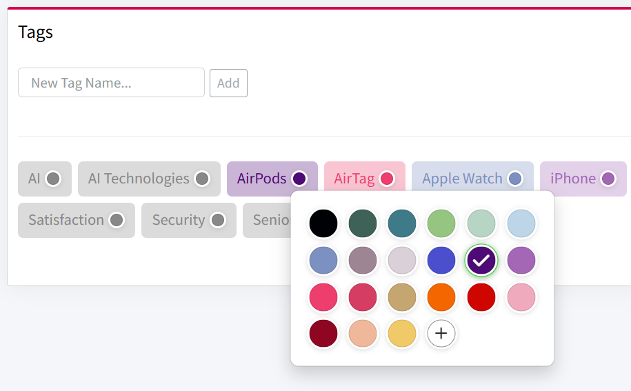
1. Assign colors to your tags:
- Navigate to “Automation & Tags” in the Mentionlytics menu.
- For each existing tag (or when creating new ones), click on the small circle next to the tag name.
- Choose your desired color from the color picker.
2. Customize your dashboard and reports:
- Go to your Overview Dashboard or open your desired report.
- Edit the “Top Tags” component.
- You’ll now find options to switch between bar, doughnut, and line charts.
- Select your desired chart type.
3. Enjoy the stunning transformation!
Why this matters:
- The new charts provide more granular insights into your tagged mentions.
- Track the performance of specific topics over time.
- Make informed decisions based on clear, visual data.
Ready to Experience the Difference?
Get more out of your tags in Mentionlytics!